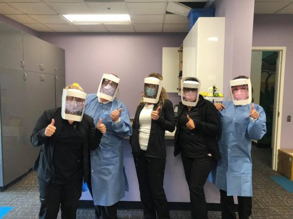
“A big thank you and virtual hug to American Carton Company for donating shields to our staff! The girls were giddy about having the extra protection and how much it allowed them to breathe!! Again thank you for the support it is greatly appreciated!” – Just for Kids Dental (4/10/2020)
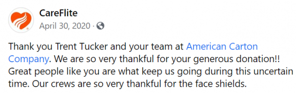
American Carton Company donates face shields to CareFlite
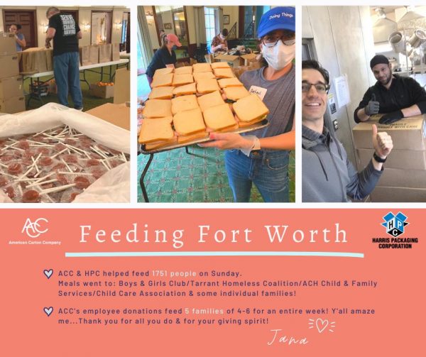
“#AmericanCarton, #HarrisPackaging and individual employees pooled donations to fight for food security with the #CrisisMealProject in Fort Worth. Employee donations alone helped feed five families of 4-6 people
for an entire week!!! The hearts of our work family are larger than life. Carlo Capua, countless volunteers and the team at Z’s Cafe and Catering are dedicating HOURS to preparing, packaging and delivering these meals to those in need in our community. Thank you so much for this opportunity to be of service – it fills our spirit tanks in a time we need it most. We are #blessed beyond words for the opportunity to give back and proud to call you neighbors! (4/22/2020)
A successful team beats with one heart
“A big thank you to our customer service rep Hayley Prins for hand sewing masks last week for all our employees! Amidst the chaos these acts of kindness make us so proud of our family at #ACC.
This past month has not been easy for any of us but our team at #AmericanCartonCompany stands strong and united.” (4/15/2020)
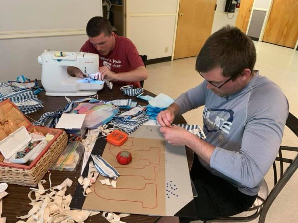
“The sewing machines are in and we are officially off to the races! Thanks to American Carton Company for the machine donations…we are more ready than ever to get these face masks made and out to the public!” – Recovered and Free Drug and Alcohol Rehabilitation Center (4/15/2020)
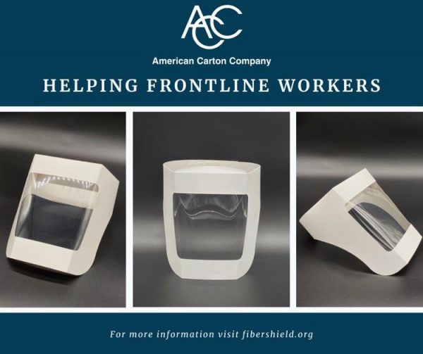
“#FiberShield is an international coalition of leading Paperboard packaging companies and supply-chain partners who have pooled their collective resources and production capabilities to supply single-use face shields to medical professionals and first responders.
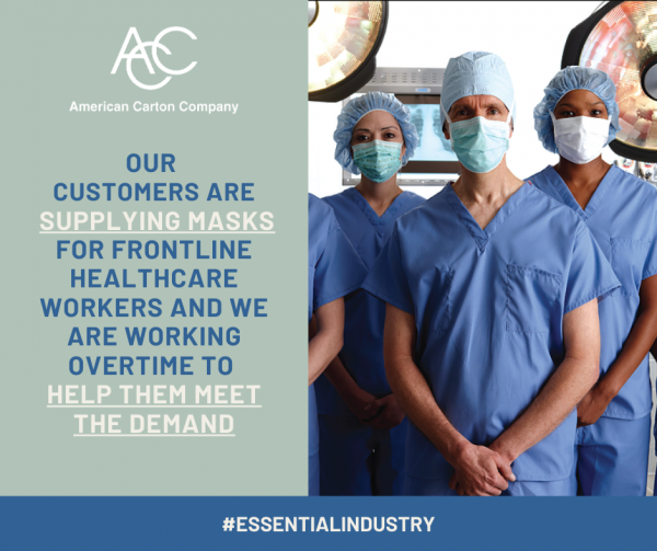
American Carton Company is proud to donate face shields to this mission: To protect the medical community that we depend on to protect us.” (4/14/2020)
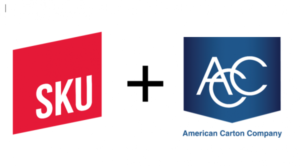
ACC is proud to announce our partnership with SKU‘s DFW track!
SKU was founded in 2011 by lawyer Shari Wynne Ressler and serial entrepreneur Clayton Christopher, founder of Sweet Leaf Tea and Deep Eddy Vodka, with the mission of accelerating #CPGs. It has been a catalyst in establishing Austin as a CPG powerhouse. SKU is the nation’s first CPG accelerator, with such alumni as Siete Family Foods, EPIC Provisions and Seaweed Bath Co. Since it was founded, more than 60 companies have completed the SKU track – A 2016 Forbes magazine column called SKU one of the nation’s top three accelerators.
SKU DFW, an accelerator for later-stage CPG startups, launched September, 2020 and American Carton Company is thrilled to be a preferred provider in packaging for SKU DFW.
Affiliate of SKU? Call us today to talk about our special package for SKU mentors and cohorts. 817.473.2992
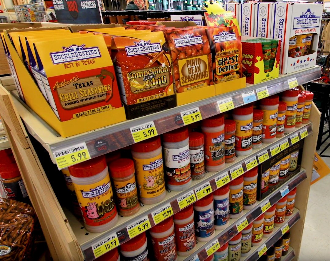
It’s always a win-win when you have a close vendor-customer relationship. SuckleBusters has been a long time customer of HPC and ACC. Not only is their product line delicious, but it looks great sporting our folding carton and corrugated boxes.
Certified and ready to deliver! Nothing means more to us than maintaining consistent quality standards throughout our manufacturing processes. ACC transitions into SQF edition 8 certification with another perfect 100 rating on its food safety audit, making the 5th year of obtaining this rating level!
What does a SQF certification do for you?
The SQF program we implemented has been designed to meet the needs of suppliers, the food industry, and consumers. These standards are compliant with the regulations enforced by the FDA. This certification offers a solution for primary producers, manufacturers, distributors, and brokers by creating one standard for food safety from farm to fork. Your customers are our customers and we make the continuous effort to offer them safe folding cartons. Follow us on LinkedIn to get the latest and greatest on the ACC team.
ACC has completed another ISO certification audit with ZERO non-conformities! This marks the 6th consecutive year with perfect ISO audits. The audit successfully transitioned ACC to ISO 9001 2015 certification. ACC is proud to uphold consistent high-quality packaging standards for our partners. Follow us on LinkedIn to instantly receive our latest and greatest news.
American Carton Company has partnered with University of Texas at Arlington to give real-world packaging experience to students in UTA’s Visual Communication Design program. Check out the video below to see how we work closely with UTA to provide scholarships and internships to the next generation of folding carton and corrugated designers.
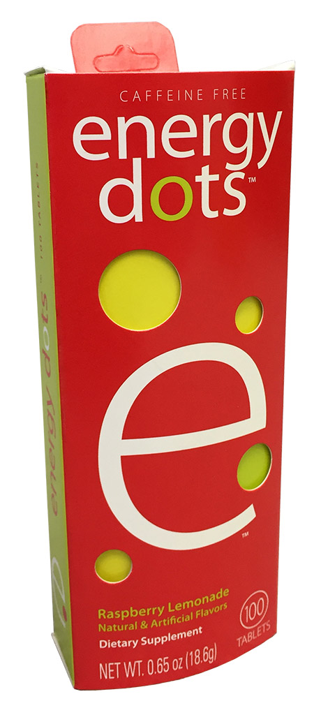
In printing, there are process colors — cyan, magenta, yellow, and black — and then there are spot colors. While process colors can make up most tones, including those in the Energy Dots example here, large areas of a single tone can be very obvious if they mismatch between print runs, or between printing companies. To ensure a uniform look across a multiple runs, or across a brand of multiple products, spot colors may be used.
Spot colors are pre-formulated inks. Instead of cyan and yellow plates creating the green on press, a green ink is prepared ahead of time, mixed to the correct tone, and loaded into the press as its own separate color. Instead of magenta and yellow forming the red, a specific red mix is prepared as its own color.
You might think of process colors as the colors a painter might mix carefully in his palette and apply to the fine details of his painting, whereas spot colors are more like the paint you choose from a swatch book when painting a room. Spot colors are meant to ensure consistency across large solid areas, multiple print runs, and entire brands. Being separate colors from the four-color process also means that they are unaffected when a pressman adjusts the process colors, such as when tuning the color of a photo. Also like choosing a paint color from a swatch book, spot colors are often chosen from a book of Pantone swatches. These Dragon Ball Z cartons make a prime example:
Here, the images, characters, and sky are all built from process colors, but the Dragon Ball Z logo is a prime candidate for spot colors. This way, as the pressman adjusts the process colors to optimize the tones in the image, the logo would remain unaffected, and would match other products of this brand, which will likely end up sitting right next to these cartons on a shelf.
But in an art file, spot colors are used for more than inks. They are often used to indicate the technical aspects of a file. The structure, or die line, should always be a spot color, as well as technical type such as dimensions. But be careful — these technical elements should always be set to overprint! If they aren’t, they will “knock out” the inks behind them, resulting in white unprinted areas all over the package in the shape of dimensions and die lines. (See our post on trapping and overprinting for more information.)
Spot colors are also used to indicate spot coating areas, such as using a gloss coating to highlight a logo in a design that gets matte coating everywhere else. They are also the preferred method for indicating emboss areas, including multi-level embossing. Again, these should always be set to overprint so that they don’t block out the art they’re placed on.
It is possible to go overboard with dozens of spot colors, which cannot be printed as such without an adverse effect on time and cost (as they would require multiple passes through the press), but when used strategically, spot colors can create a consistent look across an entire range of products, bringing your packaging to the next level and strengthening your brand image.
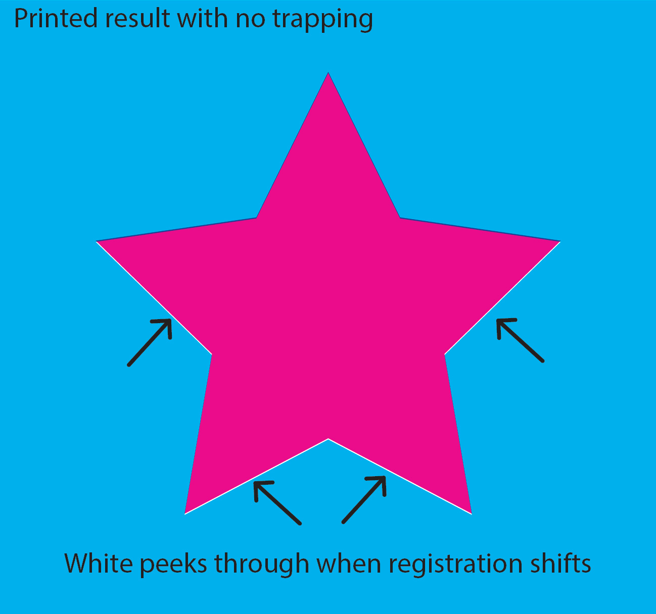
As a sheet runs through a printing press, being passed from unit to unit, it shifts. It doesn’t shift around much — in fact, the amount is barely even measurable, often just a fraction of a millimeter — but it does move, especially when flying through the press at high speed. This is simply a physical hurdle that must be compensated for when the art is being prepared. If this is not dealt with, the natural shifting in the press creates haloes and gaps where the unprinted stock peeks through.
Intended appearance: magenta star on cyan background, no overlap.Printed result with no trapping. White peeks through when registration shifts.
Click the images to see larger.
Compensating for these shifts involves extending images and colors by a mere three thousandths of an inch (8 hundredths of a millimeter), an amount invisible to the naked eye. This microscopic overlap of color compensates for the shifting of the sheet, completing an illusion of two colors butting up to each other and appearing to touch without overlapping. That 0.003-inch overlap is called a trap.
Printed result with trapping. Full ink coverage regardless of shift. Overlap becomes invisible to the naked eye.
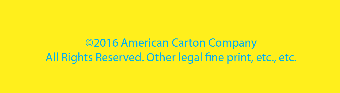
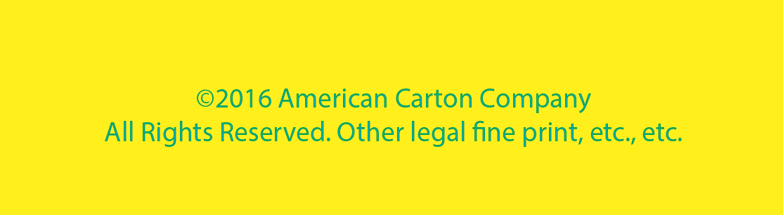
As small as 0.003 inches may sound, however, it makes up the majority of the size of thin type — for example, legal fine print. Suppose that a paragraph of cyan fine print is placed on a yellow background. This would be a problem for a few reasons.
Intended appearance: cyan type on yellow background.
First, the trap (0.003 inches all around both sides of each letter) would make up the majority of the type, creating significant overlap of the cyan and yellow, thus making the type appear green. Whoops.
Appearance after attempting to trap. Yellow trapping into cyan makes all type appear green.
But a more common example is black type on a background.
Whether that background is a photo, a gradient, or a solid color, the problem ends up being the same. Fine print — in fact, most type — is ultimately too thin to trap. But now what? If the type can’t be trapped, the shifting of the sheet will produce haloes of white around the letters unless the black type falls exactly into the space left for it in all three of the other plates — which simply will not happen because the sheet will shift between print units. Here are the four images in such an example:
And a close-up of the (simulated) resulting sheet after running through the press:
White peeks through and magenta registration can be seen when the black type does not overprint.
Obviously, the “Launch Day” type is very large and thick lettering, and could easily be trapped if we wanted to. But for all black (and small) type, the solution is overprinting. Setting the black type to overprint means that the cyan, magenta, and yellow will not leave a space for the black. They will print their images normally, and the black type goes on top of it. The result?
Crisp, smooth type over a pleasant background. No peeking white, no registration issues.
These are just some of the nuts-and-bolts details that our prepress team obsesses over, day in and day out. We hope the next time you need quality, professional printing, you’ll allow us to take care of these details for you.
The diecutter is another of the more fascinating aspects of a printing job because these amazing machines do so many things simultaneously. In a single pass through the diecutter, a sheet is scored, embossed, cut, and scrapped, all at virtually the same time. What enters is a printed sheet, but what comes out is a nearly-finished carton, needing only to be glued and folded.
Here, all of the job’s planning and preparation is put to use. The press sheet layout, the blueprint by which the sheet was printed, is sent to a die maker, who constructs the cutting die specifically for the job being run.
Like a massive industrial cookie-cutter, a cutting die is pressed down onto the press sheet. Sharp cutting rule is bordered by soft rubber, preserving the carton’s finish as it is cut. Rounded scoring rule presses down to form the scores, while a counter plate below — with a groove in the shape of the score — presses up, holding the rest of the carton steady around the scores. Wooden stripping boards push out hanger holes and windows, and the sheet’s scrap is separated from the cartons by the blanking module…all in a heartbeat. The diecutter then drops the flat cartons in its delivery area, forming neat stacks ready to be loaded into the gluer.
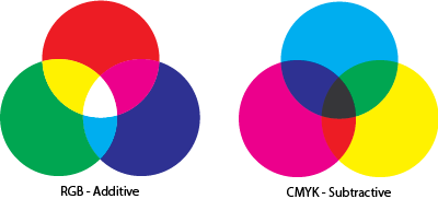
When the prepress department receives art for a job, one of the most common oversights we see in any given file is the use of RGB (Red/Green/Blue) color space, when print technology is based on CMYK (Cyan/Magenta/Yellow/BlacK). So what’s the difference? Obviously in the example image here, the RGB version is more vivid, colorful and all-around better looking. So what’s the problem? Can’t that press use RGB?
Well, it’s not really that simple. RGB and CMYK are opposites of each other — additive and subtractive color spaces. In plain English, that simply means that in RGB, if you add all colors in the spectrum together, you get white. This is how the human eye perceives color, and is how computer monitors and TV screens present color. RGB, essentially, is based on light.
CMYK, on the other hand, is necessarily based on ink. As all of the colors are added together, the result is black. If you’ve ever mixed colors in a home painting kit, you may have been disappointed after accidentally producing black paint when you tried to mix too many tones. This is the same concept. While RGB adds more light to create brighter colors, CMYK absorbs (subtracts) light, creating darker tones. The difference between the two color spaces is most apparent in blue and green tones, as shown in the traffic light image.
The issue comes into play because Adobe Photoshop, the most widely used program for graphic design, selects the RGB color space by default when creating a new file. It’s an understandable choice — most design work is created for media that’s viewed on a screen (light-based color) and RGB has a wider range of colors. Most designers don’t give it a second thought, but these are major matters to a printer who then has to attempt to match the vivid colors with a more limited color spectrum. Depending on the image, a great deal of manual adjustment may be needed to return the color to something even resembling the original RGB image… and even that may not be possible. The problem is that even if the printer is able to color-correct the image back into a pleasing range, it can take an inordinate amount of time — which means a greater cost for both customer and printer.
The safest solution is to simply design in CMYK from the beginning. If this is not possible, convert the source images to CMYK before sending to the printer so you can see how much of a difference the conversion will make.
But even this can lead to false results at times. To truly see how a file will really look when printed, it must be previewed with overprinting, an option in Adobe Illustrator that’s available only in CMYK mode.
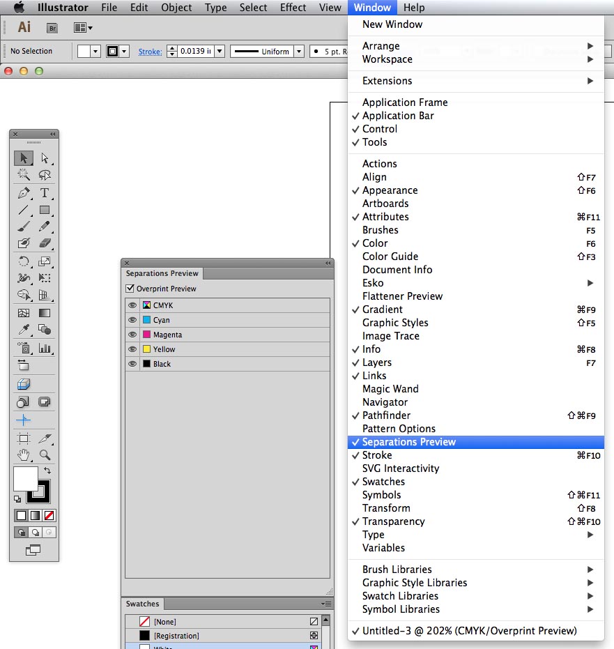
To preview overprinting, select the “Window” pulldown in Illustrator, and then “Separations Preview” (highlighted). In the window that appears, check the “Overprint Preview” box. This allows colors to be toggled on and off, previewing how each individual print plate will appear. This gives a more accurate impression of how colors will appear when mixed together (especially useful if spot colors are present).
Soon we’ll look at other uses for the Overprint Preview and how it can help detect a range of print issues before they happen.
for an entire week!!! The hearts of our work family are larger than life. Carlo Capua, countless volunteers and the team at Z’s Cafe and Catering are dedicating HOURS to preparing, packaging and delivering these meals to those in need in our community. Thank you so much for this opportunity to be of service – it fills our spirit tanks in a time we need it most. We are #blessed beyond words for the opportunity to give back and proud to call you neighbors! (4/22/2020)
 for an entire week!!! The hearts of our work family are larger than life. Carlo Capua, countless volunteers and the team at Z’s Cafe and Catering are dedicating HOURS to preparing, packaging and delivering these meals to those in need in our community. Thank you so much for this opportunity to be of service – it fills our spirit tanks in a time we need it most. We are
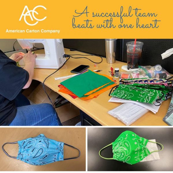


 The issue comes into play because Adobe Photoshop, the most widely used program for graphic design, selects the RGB color space by default when creating a new file. It’s an understandable choice — most design work is created for media that’s viewed on a screen (light-based color) and RGB has a wider range of colors. Most designers don’t give it a second thought, but these are major matters to a printer who then has to attempt to match the vivid colors with a more limited color spectrum. Depending on the image, a great deal of manual adjustment may be needed to return the color to something even resembling the original RGB image… and even that may not be possible. The problem is that even if the printer is able to color-correct the image back into a pleasing range, it can take an inordinate amount of time — which means a greater cost for both customer and printer.