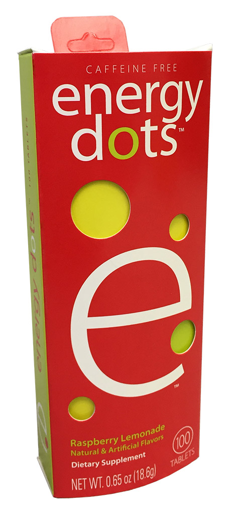
In printing, there are process colors — cyan, magenta, yellow, and black — and then there are spot colors. While process colors can make up most tones, including those in the Energy Dots example here, large areas of a single tone can be very obvious if they mismatch between print runs, or between printing companies. To ensure a uniform look across a multiple runs, or across a brand of multiple products, spot colors may be used.
 Spot colors are pre-formulated inks. Instead of cyan and yellow plates creating the green on press, a green ink is prepared ahead of time, mixed to the correct tone, and loaded into the press as its own separate color. Instead of magenta and yellow forming the red, a specific red mix is prepared as its own color.
You might think of process colors as the colors a painter might mix carefully in his palette and apply to the fine details of his painting, whereas spot colors are more like the paint you choose from a swatch book when painting a room. Spot colors are meant to ensure consistency across large solid areas, multiple print runs, and entire brands. Being separate colors from the four-color process also means that they are unaffected when a pressman adjusts the process colors, such as when tuning the color of a photo. Also like choosing a paint color from a swatch book, spot colors are often chosen from a book of Pantone swatches. These Dragon Ball Z cartons make a prime example:

Here, the images, characters, and sky are all built from process colors, but the Dragon Ball Z logo is a prime candidate for spot colors. This way, as the pressman adjusts the process colors to optimize the tones in the image, the logo would remain unaffected, and would match other products of this brand, which will likely end up sitting right next to these cartons on a shelf.
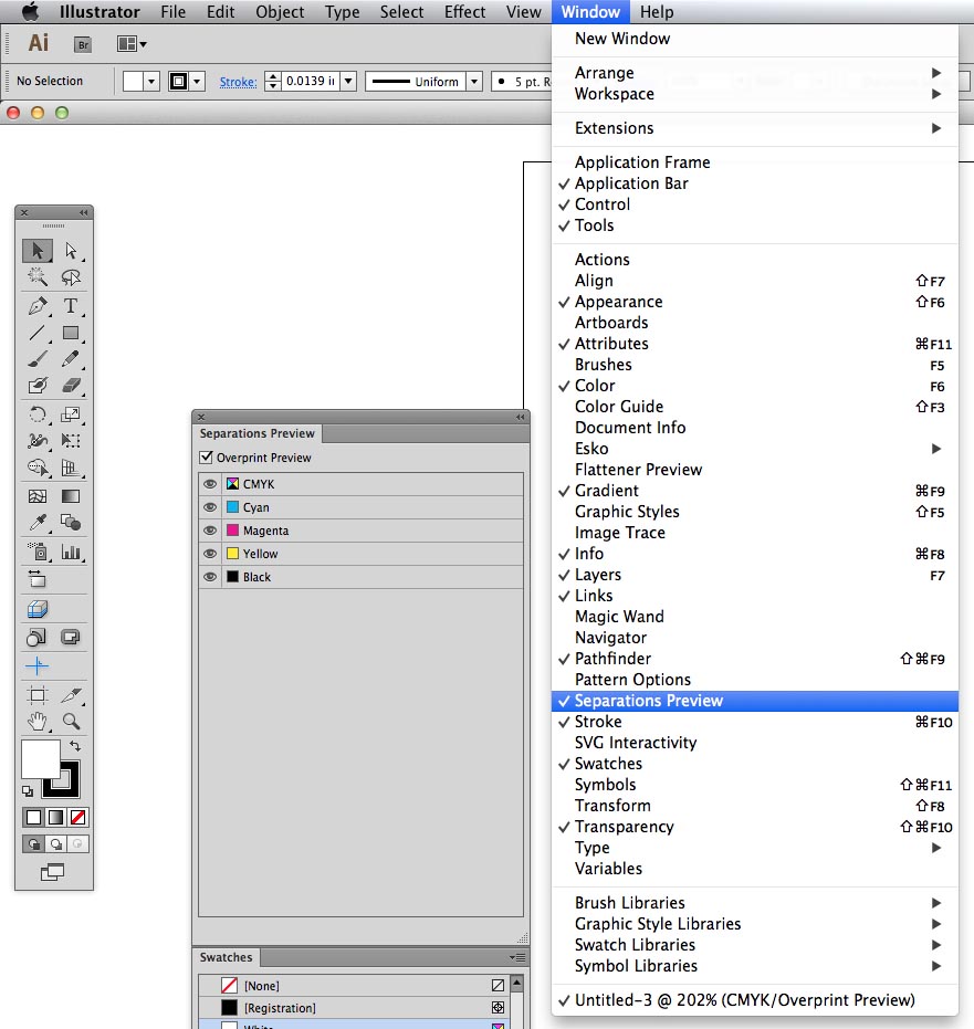
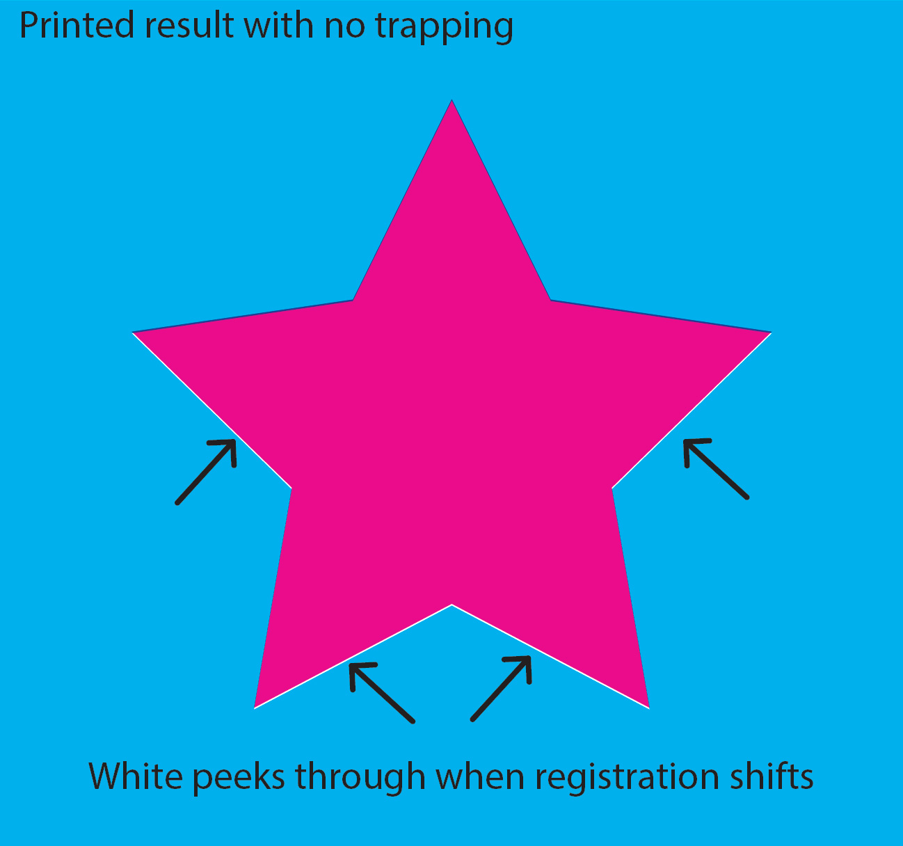
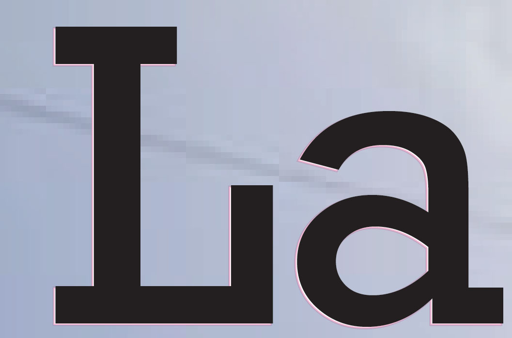
But in an art file, spot colors are used for more than inks. They are often used to indicate the technical aspects of a file. The structure, or die line, should always be a spot color, as well as technical type such as dimensions. But be careful — these technical elements should always be set to overprint! If they aren’t, they will “knock out” the inks behind them, resulting in white unprinted areas all over the package in the shape of dimensions and die lines. (See our post on trapping and overprinting for more information.)
Spot colors are also used to indicate spot coating areas, such as using a gloss coating to highlight a logo in a design that gets matte coating everywhere else. They are also the preferred method for indicating emboss areas, including multi-level embossing. Again, these should always be set to overprint so that they don’t block out the art they’re placed on.
It is possible to go overboard with dozens of spot colors, which cannot be printed as such without an adverse effect on time and cost (as they would require multiple passes through the press), but when used strategically, spot colors can create a consistent look across an entire range of products, bringing your packaging to the next level and strengthening your brand image.


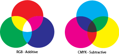 The issue comes into play because Adobe Photoshop, the most widely used program for graphic design, selects the RGB color space by default when creating a new file. It’s an understandable choice — most design work is created for media that’s viewed on a screen (light-based color) and RGB has a wider range of colors. Most designers don’t give it a second thought, but these are major matters to a printer who then has to attempt to match the vivid colors with a more limited color spectrum. Depending on the image, a great deal of manual adjustment may be needed to return the color to something even resembling the original RGB image… and even that may not be possible. The problem is that even if the printer is able to color-correct the image back into a pleasing range, it can take an inordinate amount of time — which means a greater cost for both customer and printer.